Candidate Name: Lauren Simmons
Candidate Number: 6098
Centre Name: Wilmington Gramar School For Girls
Centre Number: 61119


 I firstly had to change the background to make it all white. The way I did this without going over parts of the model was to use the magic wand tool to create a border around the model which I could not go over. I then used the paint brush and put it on the largest scale possible as the whole background would be white and this was a quicker way to fill in the whole background.

 I then started to edit the second photo I needed for my double page spread. I did it in the same routine as before, by firstly as a whole editing the background of the photo to make it white.
  I then focused on the holes between her legs which needed to be filled in with white paint. To do this I zoomed in again, and made the paint brush much smaller so I could go right to the edge of her legs, without painting over part of her body.
 I then focused on her hair which yet again was the hardest part of editing overall. On the left hand side you can see a piece of hair which sticks out marginally from the rest of the hair, and so I decided to edit this out as I thought it was unnecessary in the photo and made her hair look slightly messy.
 I then started to lay and set out my double page spread. I firstly put down the large name of 'Laura' as my double page spread would be shaped around this.
 After this I added the text that would be on the double page spread and made it the right width columns. I also had to make sure it didn't overlap any of the title as this is a large part of the page. I had to adjust what writing went in what column as at first it was uneven and looked slightly messy.
 I then added the photos to the picture and adjusted them so that they fit properly on the page. I had to adjust how far apart the columns of writing were to fit the picture inbetween, but this was not that hard. At first I wanted the model to look as if she were actually standing on the 'L' but this proved extremely difficult and as her feet aren't flat on the ground I could not do this.
 I then added the final small features, such as the quotation on the top left hand side and the name of the artist in the corner. The full name of the artist was added as there was an empty space which I felt needed filling, as it looked bare and as if there should be something there.


 With this first drawing I just tried to experiment by putting all the features on the front page. This proved a useful process as it allowed me to see what I could fit on a page and how I could do it. The layout of this first design is not very effective as I do not like how there is just a picture either side of the page, and there is hardly any room for the quotation so had to be squashed inbetween the title and the text of the article.
 This is not a good layout for my double page spread for many reasons. The page is very bland and does not have much to it as there is only one picture and no quotations. I also do not like the fact that the picture just sits on top of the title as I think this would slightly odd. However I do like that the title has been moved to the bottom as I think this draws elements on the page together.
 This double page spread design is much more what I would like mine to look like, however there is a problem with this design. It only has one picture of my model and I need to include two pictures on this page. However this is a vast improvement from my other designs as is heading towards what I would base my double page spread around.


 This double page spread example is extremely effective and would be good to base mine around. I like how the model looks, with quite a striking pose, and the black leather outfit is similar to what I would want my model to look like. The use of the faint block writing in the background is effective, and I would like to in co-operate something like this into my double page spread somehow. I again like the use of the large 'D' to show where the interview begins. I will most likely not have my model resting on any sort of prop as this is not the look that I want to go for. I like the use of the picture on the left hand side and the writing on the right hand side, and I also think the use of the same colour background is effective as it uses continuity and doesn't separate the two pages. I would like to base a large amount of my features around this magazine as I feel this example of a double page spread links in with the look and feel of my front cover and double contents page.
 There are also aspects of this double page spread which I like. The use of the large title is very effective as it attracts readers and lets them know what the article is about. I like the use of the capital 'T' as well, this clearly shows where the interview begins. The use of the large quotation is also very effective and I will definitley inco-operate this into my own magazine. However I do not like how seperated the two sides of the page are, thew right hand side has a light background to see the writing however the left hand side is very different and the background is extremely dark. I wouldn't want my model to look like this as my model will not be a man, and I also do not like the use of the prop he is standing on. Yet again there are aspects of this double page spread which I wikll base my magazine around however this is not the look that I am going for with my magazine.
 I feel this double page spread example is not very effective and I would not like to base mine around this idea. Ths is because the writing is pushed over quite far to the right side, and very seperate from the picture. I also do not like how small the writing is, and the use of only one column I think makes the page look quite unappealing. The use of the picture is good as it gets the whole band in, and they are pulling strong bold poses. However there is no sort of title to tell us what the article is about or what the band is called. I would not use this example of a double page spread layout to base around my own one, as I feel this is not the look I am going for.
 I like this double page layout and design slightly more. There is large wording of a quote which has been taken from the article, which I will add into my double page spread as I think this is extremely effective and attracts readers and keeps them interested. On the left hand side at the top it also has a small title to say what the article is about which I also like. However I do not like the use of the smaller pictures on the bottom right hand side as I think it makes the page extremely cluttered. I feel the page is quite squashed together and makes it hard to see a focus of the page. I do feel this double page spread layout is adequate however it would not be in keeping with my magazine and it wouldn't be appropriate.

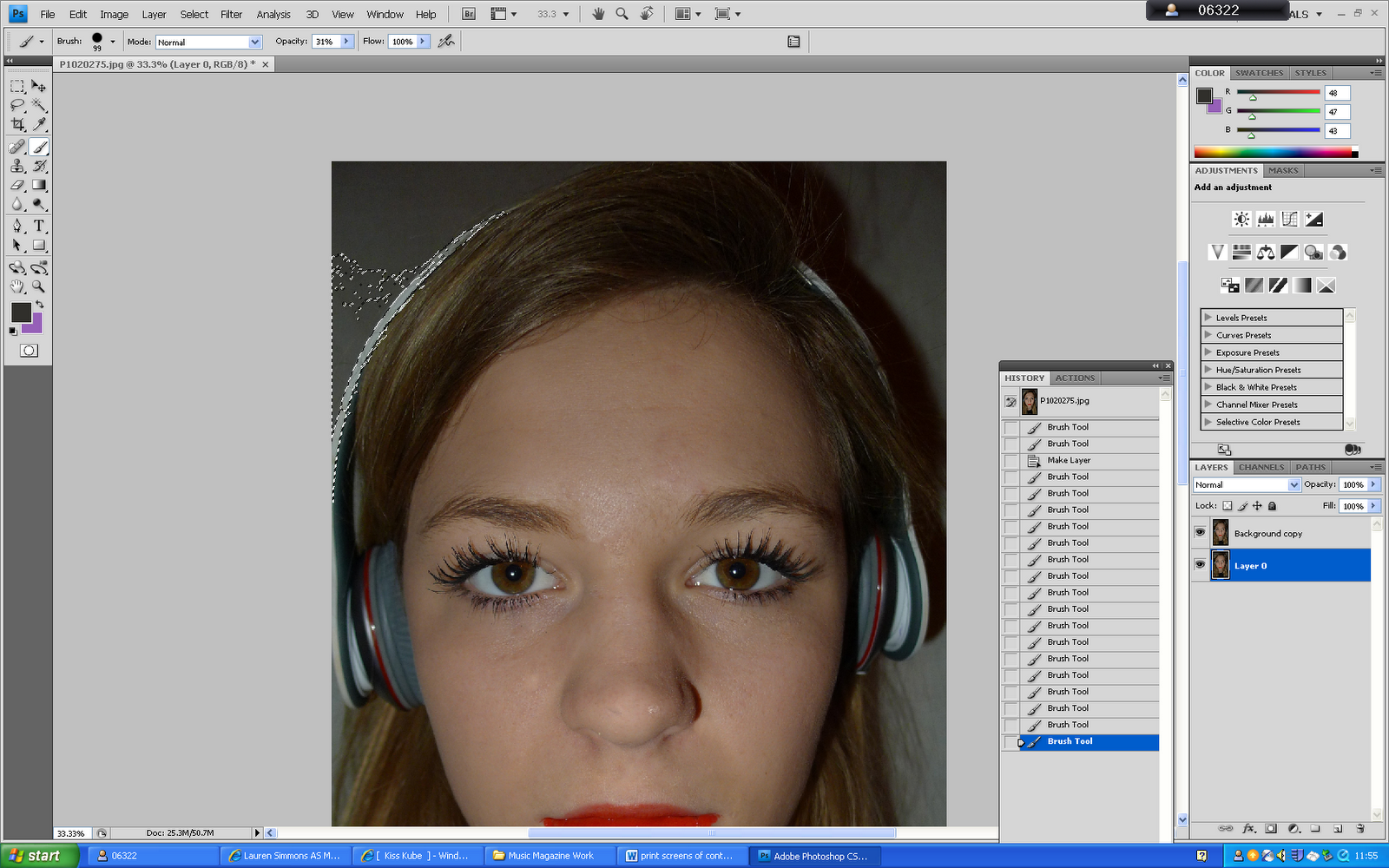
 To make sure my editing was done effectively I had to zoom in on her face so that I could clearly see what I needed to edit. When zooming on her face I found some blemishes on her face, such as on her chin and forehead, which I needed to remove on her face to give a clearer complexion.


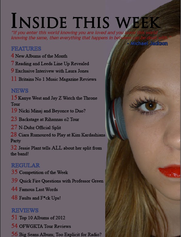
 eyes are extremely bold, creating a statement. Her lips are very red and slightly pouting which gives off a slight attitude to her without that being the main focus of the photo. the headphones are also well included in the photo and we can see them well and that it is one of the main focuses of the picture. However my research shows that the photo would only have half of the models face. When doing the photoshoot I tried to take photos of only half the models face, however this proved very difficult due to shadowing and getting the right exact amount of the face into the photo. Therefore when editing my photo I will just cut out half of her face and only focus on one half to add to my contents page as this seems a more conevenient idea.