


 For my second photo shoot I had a complete transform of scenery, as well as change of look for the model. From my first photo shoot I thought that the photos were slightly boring and dull. To change this I decided to go into an outdoor environment, which was quite secluded and had quite a dark feel and atmosphere to it. I wanted my models poses to be more striking and 'gritty' as that is the message that I want to portray on the front cover of my magazine. The clothes of that my model was wearing were slightly different clothing. She was still wearing ripped shorts which were fairly short, however her socks changed from black ones to slightly more bright ones with long white socks with blue and red bands round the top of them. The top, shorts, and socks work well together as they flow in an outfit, however the coat is quite frumpy and does not go with the rest outfit. This was a negative effect to my photos as it shadowed the outfit she was wearing, and became quite over bearing. Although I like the use of the cigarette, as it gives off quite an edgy and rebellious feel, it can be quite hard to photograph in the right way. When
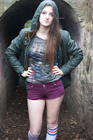
 she is blowing out smoke it can cover quite a lot of her face, making it hard to get a clear, sharp photo of her face. The use of a cigarette can also give off a wrong image, as the issue of smoking can be quite controversial, and some people would not like to see a model smoking on a front page of a magazine. Therefore in my next set of photos I will consider not using the cigarette as a prop. I feel the background of the photos gives quite an ominous feel, which adds to the theme of photos that I wanted. However this affected the lighting of the photos as it became harder to get lighting
 on the the face, so that I could have a clear, defined face. I think these set of photos are an improvement from the last set of photos, and I am starting to go down a particular route of how my photos want to look, however these are still not to the standard that I want to use for my front cover. For my last photo shoot I will make sure the the outfit goes well together, flowing throughout. I will also look at finer details such as the colour of her lips and nails, and accessories such as the style and colour of her earrings. I also feel that there needs to be more focus on her face and make-up, I will do this by putting more eye-catching and bold make up on my model, and take more shots of her face close up.

To start with, I tested the different sort of fonts I could use, using trial and error to see which ones would possible suit the front cover of my magazine. The fonts are extremely different from each other as I wanted to see the differences and contrasting ideas that I could come up with. Many of them were not suitable for my front cover as I felt they didn't give the right feel of a music magazine, and not the type of music magazine I am trying to create. I wanted more of a bold and striking title so it can stand out from my photo, so I then started looking for fonts which would do this. I wanted quite an original title, but I did not want it to be hard to read or not relate or suit the look of my front cover. 
I narrowed it down to these final fonts which I thought would be most suitable for my front cover. I think these are all adequate fonts apart from the second one, as they are bold, and could grab the attention of a reader easily. After choosing five different fonts, I finally chose to use the bottom font.
This is the font title that I will use for the front cover of my magazine.  I thought this was most suitable for my magazine, as it stands out on a page as it is fairly bold. The font is also quite simple, yet the slantedness and the slight curl of the words makes it a little bit more interesting, and gives the music feel that I want with my magazine. The small gap between each letter is also effective as it makes it bold, whilst also having a quite simple look. I feel this font will be effective and work well with my magazine as it will flow well with the front cover of my magazine.
When choosing the name of my magazine, I wanted to it to be one word, with quite a strong and bold title. I came up with a few ideas which I thought could be used well on the front of my magazine. The ideas I came up with were:
- Iconic
- Voltage
- Vibe
- Alternative
- Mainstream
When questioning my friends and family, the majority of them thought that the word 'Iconic' was best fitting for the title of my magazine, as did I. I thought that this word would also be good for the title of my magazine as has quite a solid presence on the page which will bring attention to it.


 For my second photo shoot I had a complete transform of scenery, as well as change of look for the model. From my first photo shoot I thought that the photos were slightly boring and dull. To change this I decided to go into an outdoor environment, which was quite secluded and had quite a dark feel and atmosphere to it. I wanted my models poses to be more striking and 'gritty' as that is the message that I want to portray on the front cover of my magazine. The clothes of that my model was wearing were slightly different clothing. She was still wearing ripped shorts which were fairly short, however her socks changed from black ones to slightly more bright ones with long white socks with blue and red bands round the top of them. The top, shorts, and socks work well together as they flow in an outfit, however the coat is quite frumpy and does not go with the rest outfit. This was a negative effect to my photos as it shadowed the outfit she was wearing, and became quite over bearing. Although I like the use of the cigarette, as it gives off quite an edgy and rebellious feel, it can be quite hard to photograph in the right way. When
 she is blowing out smoke it can cover quite a lot of her face, making it hard to get a clear, sharp photo of her face. The use of a cigarette can also give off a wrong image, as the issue of smoking can be quite controversial, and some people would not like to see a model smoking on a front page of a magazine. Therefore in my next set of photos I will consider not using the cigarette as a prop. I feel the background of the photos gives quite an ominous feel, which adds to the theme of photos that I wanted. However this affected the lighting of the photos as it became harder to get lighting
 on the the face, so that I could have a clear, defined face. I think these set of photos are an improvement from the last set of photos, and I am starting to go down a particular route of how my photos want to look, however these are still not to the standard that I want to use for my front cover. For my last photo shoot I will make sure the the outfit goes well together, flowing throughout. I will also look at finer details such as the colour of her lips and nails, and accessories such as the style and colour of her earrings. I also feel that there needs to be more focus on her face and make-up, I will do this by putting more eye-catching and bold make up on my model, and take more shots of her face close up.


